Patch Notes - Vanilla Components v1
Version 1 of Vanilla Components introduced components as an NPM package, and is the new standard for Embeddable development that this documentation references. This page contains patch notes for each NPM release of Vanilla Components, including bug fixes, new features, and breaking changes (if any).
Version 1.1.15 - CSV Download Fix
- Ensured that CSV downloads for table data are sorted by column header order, regardless of what page you're on.
Version 1.1.4 - Minor Improvements
- Added option in Table and Pivot Table to choose whether numbers are rounded to a decimal place (and how many decimal places), similar to other charts and graphs
- Fixed dropdown menu chevrons opening on click but not closing on click
- Fixed an issue where empty datasets on the Comparison Line Chart would cause the download CSV button to spin forever
Version 1.1.13 - Z-Index Fix
- Fixed an issue where dropdown components were appearing behind other components in apps where more than one dashboard was embedded.
Version 1.1.12 - Border Fix
- Fixed an issue where borders on some charts and graphs were not displaying in builder mode (they were still displaying in the preview and on published dashboards).
Version 1.1.11 - KPI Improvements
- Allowed KPI charts to abbreviate long numbers (eg
1,200to1.2k,1,200,000to1.2m, etc). This change is backwards compatible, as it defaults to "false" in the KPI inputs.
Version 1.1.10 - Minor Improvements
- Added an option in the Table and Pivot Table components to remove Markdown links from data and just leave the text that was linked (eg
[Embeddable](https://embeddable.com)becomesEmbeddablein the CSV. - Fixed an issue where the dropdown options were not expanding to the same size as the dropdown itself, causing text to be unnecessarily cut off.
Version 1.1.9 - CORS and Table Improvements
- Ensured that all Google font
linktags havecrossorigin="anonymous"which should help with potential CORS issues is some setups - Table cells can now display arbitrary JSON. Includes a new setting to indicate whether cells should expand to show the entirety of the JSON value or clip it.
Version 1.1.8 - Heat Grid, z-index, and replaceAll fixes
- Fixed Heat Grid Sizing Issues (it will now scroll horizontally in small containers)
- Moved all hard-coded z-index values in components to theme
- Fixed an issue where
replaceAllwas sometimes being called on non-string values coming in from Dimensions, leading to error messages.
Version 1.1.7 - Bug Fixes
- Updated Bar Chart "limit" input to properly reflect the existing default
- Fixed a bug that was causing the stacked area chart to render a blank canvas in certain circumstances
Version 1.1.6 - Internal Fix
- Fixed an internal issue relating to publishing to NPM.
Version 1.1.5 - Custom Granularities
- Added support for custom granularities via Cube.js data models. This means you can now add e.g. "Last 15 minutes" or "Last 18 days" as options in the Granularity Picker and Date Range Picker w/ Granularity components. You can find more instructions on the Extending Types documentation page.
Version 1.1.4 - Fixes and a New Components
- Improved theming of fonts on controls (eg dropdown)
- Updated to latest SDKs
- Fixed default sort not always applying on Pivot table
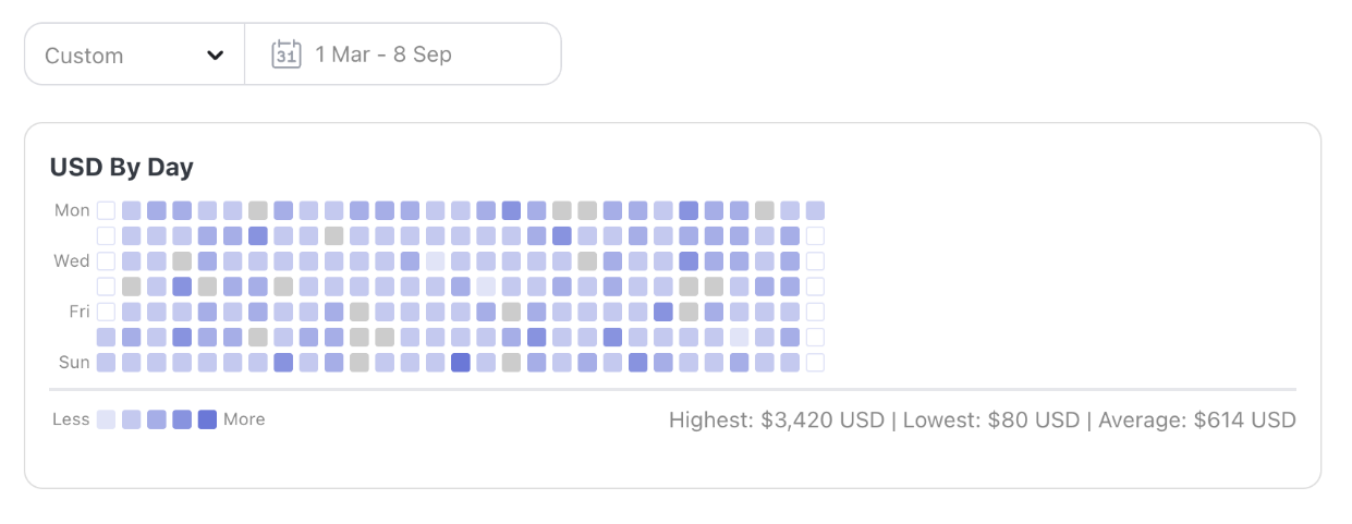
- Added a new component: Heat Grid! It's a Github-style heatmap grid that can be used to visualize data over time.
Version 1.1.3 - Small Fixes
- Fixed "default sort direction" on Table component not always being applied
- Adjusted Pie Chart logic so that if "view as percentages" is on, and CSV data is downloaded, the CSV data will also display percentages
- Added Aria labels and role descriptions to all charts to improve accessibility
- Improved
nullvalue handling with Download Button component (allnull,undefined, orNo Valuevalues are now empty cells in the resulting CSV)
Version 1.1.1 & 1.1.2 - Bug Fixes
- Fixed an issue where the "Next" button on Table Pagination was not working correctly in some instances.
- Fixed an issue where in rare cases the Table Chart would crash when interpreting strings and getting a
nullvalue instead of an empty string.
Version 1.1.0 - Automatic Granularity
- Updates components to work with the new automatic granularity feature in the Embeddable SDK, which recognizes when time dimensions are used and automatically adds a granularity picker just below them. In order to keep this release backwards-compatible with existing dashboards, any components (such as Time Series Bar Chart) that previously used a dedicated granularity picker will continue to do so. However, new components and any components that did not previously include a granularity picker will use the automatic granularity picker by default.
Version 1.022 - Dropdown sort
- Adds the ability to sort the Dropdown and Multi-Select Dropdown components
Version 1.0.21 - Download Menu
- Significantly improved the ability to theme the Download Menu. You can find all of the new theme values in the default theme file (opens in a new tab) in the new
downloadMenusection. This change may introduce very slight visual differences in the Download Menu, but it is not a breaking change. The default values remain the same, the menu is just more flexible now.
Version 1.0.20 - Chart Label Theme Improvements
- Improved the handling of chart labels, allowing users to theme labels on a per-chart-type basis. This is a non-breaking change, as the default values remain the same. You can see all of the new theme values in the default theme file (opens in a new tab).
Version 1.0.19 - Table Improvements
- Ensured that the normal and pivot tables both display boolean values as "True" or "False" instead of just a blank string.
Version 1.0.18 - Chart Fix
- Fixed an issue with the Bar Chart and displaying axis values.
Version 1.0.17 - CSS and Bar charts
- Moved several CSS items in
index.css(opens in a new tab) to new theme values (opens in a new tab). This is a non-breaking change as all the values are set to the same values as before. - The Bar Chart now automatically includes a "Granularity" sub input when the X-Axis is a date, allowing users to choose between "Day", "Week", etc. If you leave it blank, the chart defaults to "yyyy-mm-dd", eliminating those long, ugly UTC strings.
Version 1.0.16 - Links and themes
- Allowed links in table cells using markdown link formatting
- Made Multi-Select buttons Theme-reactive
- Updated to latest SDK versions
Version 1.0.15 - Improvements
- Improved default value handling for Dimensions / Measures as variables
- Updated the name of a CSS file for clarity
Version 1.0.14 - New Features, Fixes, and More
- Added new components to support Dimensions and Measures as variables
- Added "previous week" to granularity options in comparison filter
- Added the ability to label table columns individually
- Fixed a theme error when building (didn't impact end users)
- Fixed some bugs with the multi-select dropdown
- Updated to latest SDK versions
Version 1.0.13 - Theme Improvements
- Improved Background colors in Dropdown and Multi-Select Dropdown components
- Improved focus/blur handling in Dropdown and Multi-Select Dropdown components
- Datepicker start/end days correctly match radiuses in all situations
- Line tension values are now settable in themes, impact Line Chart, Comparison Line Chart, and the optional line on the Bar Chart component (uses new theme values (opens in a new tab))
- Line Chart interpolation modes can now be controlled in the theme (uses new theme values (opens in a new tab))
- Improved Datepicker SVG color handling
- Pie Chart border width and color can now be themed (uses new theme values (opens in a new tab))
- KPI charts now default to save as PNG off (can still be turned on in the inputs)
- Border radius on Pagination now matches other border radiuses
- Titles and Descriptions can each have their own color separate from each other and the body font -(uses new theme values (opens in a new tab))
- Titles and Descriptions can each have their own weight separate from each other and the body font -(uses new theme values (opens in a new tab))
- Titles and Descriptions can each have their own font family separate from each other and the body font (uses new theme values (opens in a new tab))
Version 1.0.12 - Custom Fonts
- Users can now add custom fonts to a
urlsarray in the theme file, and the the Embeddable dashboard will automatically load them - These fonts can then be referenced in the
font.familyproperty of the theme file
Version 1.0.11 - Keyboard Accessibility
- Added keyboard accessibility to the Dropdown and Multi-Select Dropdown components, allowing users to navigate options using the keyboard
- Added keyboard accessibility to the Download Menu, enabling users to open and select download options using the keyboard
Version 1.0.10 - Bug Fixes
- Fixed an issue where the Comparison Line Chart was breaking when only a single X-Axis value was provided
Version 1.0.9 - Bug Fixes
- Fixed an issue with the X-axis on the Time Series Line Chart
Version 1.0.8 - Pie Chart booleans & CSS Variables
- The Pie Chart now correctly displays boolean values as "True" or "False" instead of "True" or a blank string in tooltips
- CSS variables should now update correctly when Client Context changes regardless of how many Embeddables are on the page
Version 1.0.7 - Second X-Axis
- The Comparison Line Chart now supports adding a second X-Axis (e.g. for comparing two time periods)
Version 1.0.6 - Improvements
- The Bar Chart can now be sorted by any dimension or measure, regardless of whether they've been chosen as display values
- Dropdown and Multi-Select Dropdown now correctly recognize when a user clicks off of them
Version 1.0.5 - Download All
- The Table component now supports a "Download All" option in the download menu that gets the entire dataset, not just a single page of results
Version 1.0.4 - fixes
- Fixed NPM-reported vulnerabilities in dependencies
- Ensured dynamic X-Axis value remains when data updates
- Improved Dropdown and Multi-Select Dropdown focus/blur handling
Version 1.0.3 - Download Button
- Allows the Download Button to correctly recognize filters
Version 1.0.2 - Controls
- Ensured that background colors, border radiuses, and border colors can be properly set for:
- Text Input
- Number Input
- Dropdown
- Multi-Select Dropdown
- Date Picker date range display
Version 1.0.1 - Readme Improvements
- Improved README to clarify usage and installation instructions
Version 1.0.0 - Initial Release
- Initial release of Vanilla Components as an NPM package
- Introduced the
@embeddable.com/vanilla-componentspackage - Components can now be imported and used directly in your projects