Defining Components
You can create custom React components in Embeddable using any JS libraries you like.
Key capabilities include:
- Define Inputs: Make re-usable components by defining inputs your team can customize in the builder.
- Load Data: Dynamically fetch data from your database via Embeddable's
loadDatafunction. - Pass Events: Capture user actions (e.g. button clicks) and send them back to Embeddable for interactive features like filtering.
How It Works
Build Your React Component (.tsx)
Write a standard React component - handling your UI, props, and business logic.
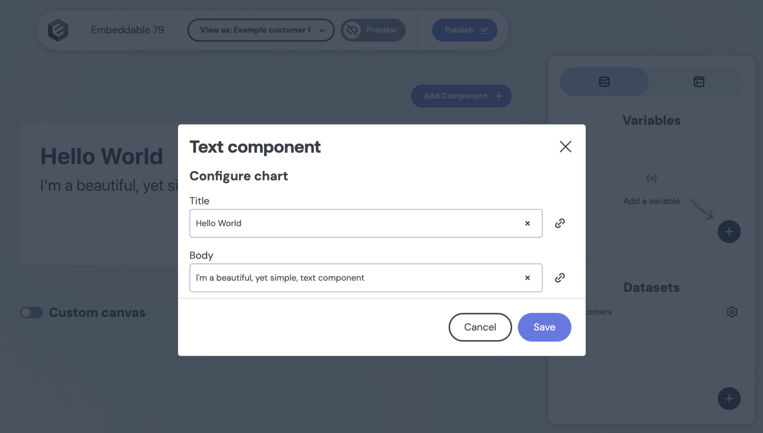
For example, this simple text component displays a title and body:
// src/components/TextComponent/index.tsx

import React from 'react';

type Props = {
  title: string;
  body: string;
};

export default ({ title, body }: Props) => {
  return (
    <div>
      <h1>{title}</h1>
      <p>{body}</p>
    </div>
  );
};
There's nothing Embeddable-specific about this code - it's just standard React.
Configure in .emb.ts
In a companion .emb.ts file, define inputs and other configuration, including how to load data. This file tells Embeddable how to expose the component in the no-code builder so it can be configured by your team without code:
// src/components/TextComponent/TextComponent.emb.ts

import { EmbeddedComponentMeta, defineComponent } from '@embeddable.com/react';
import Component from './index';
import { Inputs } from '@embeddable.com/react';

export const meta = {
  name: 'TextComponent', // a unique identifier that must match the file name (i.e. TextComponent.emb.ts)
  label: 'Text component', // user-facing name in the builder
  inputs: [
    {
      name: 'title', // unique identifier for this input
      type: 'string',  // determines the UI control to render (i.e. a text field in this case)
      label: 'Title', // the label shown in the builder
    },
    {
      name: 'body', // unique identifier for this input
      type: 'string', // renders a second text field.
      label: 'Body', // the label shown in the builder
    }
  ]
} as const satisfies EmbeddedComponentMeta;

//The function that tells the SDK to include this component in the no-code builder.
export default defineComponent(Component, meta, {
  props: (inputs: Inputs<typeof meta>) => {
    return {
      // the inputs are passed through to the React component as props
      title: inputs.title,
      body: inputs.body
    };
  }
});
Two things to notice:
inputstells Embeddable which input fields to show in the UI when using this component. In this case, two text input fields.propsis a function that takes thoseinputsand maps them onto thepropsthat should be passed into the React component when rendering.
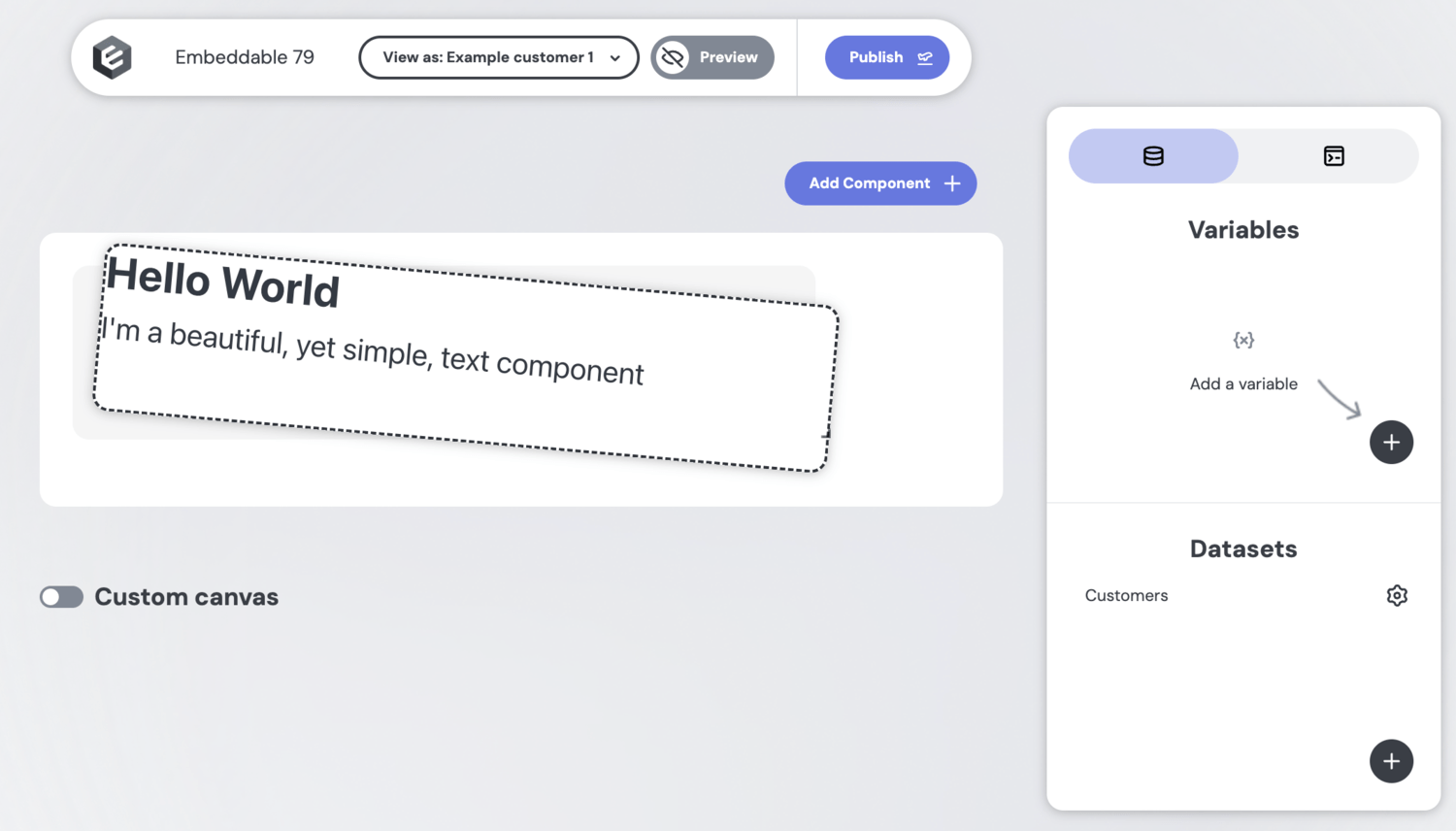
Push to Embeddable
Run npm run embeddable:dev to test out your component, and when you’re happy with it, push your component code to Embeddable. Your teammates can now drag, drop, and configure it in their dashboards - no extra coding required.
Example: a simple data component
Below is a simple KPI chart component that loads data from your database:
// src/components/KPIChart/index.tsx

import React from 'react';
import { DataResponse, Measure } from '@embeddable.com/core';
import Loading from '../util/Loading'
import Error from '../util/Error'

type Props = {
  title?: string;
  metric?: Measure; // { name, title }
  results: DataResponse; // { isLoading, error, data: [{ <name>: <value>, ... }]
};

export default ({ title, metric, results }: Props) => {

  const { isLoading, data, error } = results;

  if(isLoading) {
    return <Loading />
  }

  if(error) {
    return <Error msg={error}/>;
  }

  const value = results.data?.[0]?.[metric.name] ?? 'No data';

  return (
    <div>
      {title && <h1>{title}</h1>}
      <p>{value}</p>
    </div>
  );
};
And its .emb file, defining the inputs and configuration:
// src/components/KPIChart/KPIChart.emb.ts

import { EmbeddedComponentMeta, defineComponent, Inputs } from '@embeddable.com/react';
import { loadData } from '@embeddable.com/core';
import Component from './index';

export const meta = {
  name: 'KPIChart', // an identifier - must match KPIChart.emb.ts
  label: 'KPI Chart', // user-facing name in the builder
  inputs: [
    {
      name: 'title',
      type: 'string',
      label: 'Title text',
    },
    {
      name: 'ds',
      type: 'dataset', // shows a dropdown of available datasets. These are created directly in the Builder.
      label: 'Dataset',
    },
    {
      name: 'metric',
      type: 'measure', // shows a dropdown of measures (defined in your data models)
      label: 'KPI',
      array: false, // specifies that users can select a single measure
      config: {
        dataset: 'ds', // restricts measure options to the selected dataset
      }
    },
  ]
} as const satisfies EmbeddedComponentMeta;

//The function that tells the SDK to include this component in the no-code builder.
export default defineComponent(Component, meta, {
  props: (inputs: Inputs<typeof meta>) => {
    return {
      ...inputs, // the inputs are passed through to the component as props
      results: loadData({ // fetches data from your database and passes it to your component
        from: inputs.ds,
        measures: [inputs.metric],
      })
    };
  }
});
The defineComponent and loadData functions used above are two of the most powerful parts of the Embeddable SDK. You can learn more about them here: defineComponent and loadData.
Adding Component Previews
Embeddable supports real-time previews for all components, including any you create. You will see these previews when you click the "Add Component" button in the dashboard builder.
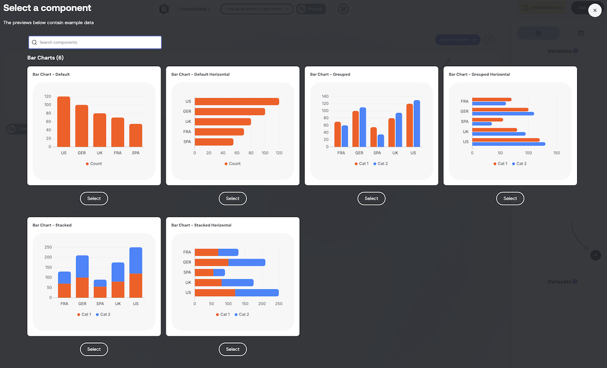
To define your own components, you will need to provide sample data for the various inputs you've defined, especially any required inputs. To easily create sample data, you can use the mock data functions provided by the Embeddable core package.
// src/components/YourComponent/YourComponent.emb.ts
import { mockDataResponse, mockDimension, mockMeasure } from '@embeddable.com/core';
To create sample data, you can use the mockDimension and mockMeasure functions to create mock dimensions and measures, and the mockDataResponse function to create a mock data response. You can keep these definitions in the .emb.ts file or create a separate sample data file to keep things organized.
// src/utils/sampledata.ts
const dimensionName = 'country';
const dimensionGroupName = 'category';
const measureName = 'sales';

const sampleData = {
  dimension: mockDimension(dimensionName, 'string', { title: 'Country' });
  dimensionGroup: mockDimension(dimensionGroupName, 'string', { title: 'Category' }),
  measure: mockMeasure(measureName, 'number', { title: 'Sales' }),
  const results1Measure2Dimensions = mockDataResponse(
    [dimensionName, dimensionGroupName, measureName],
    [
      ['US', 'Cat 1', 120],
      ['US', 'Cat 2', 130],

      ['GER', 'Cat 1', 100],
      ['GER', 'Cat 2', 110],

      ['UK', 'Cat 1', 80],
      ['UK', 'Cat 2', 95],

      ['FRA', 'Cat 1', 70],
      ['FRA', 'Cat 2', 60],

      ['SPA', 'Cat 1', 55],
      ['SPA', 'Cat 2', 35],
    ],
  );
};
To tell Embeddable you're creating a preview, you can use the definePreview function from the Embeddable React package:
// src/components/YourComponent/YourComponent.emb.ts
import { definePreview } from '@embeddable.com/react';
To define the preview, you can call the definePreview function, passing in your component and an object containing the sample data for each input. Note that required inputs must be provided with sample data for the preview to work correctly. Optional components can be left out if desired, though in some cases they may affect the component preview.
// src/components/YourComponent/YourComponent.emb.ts
export const preview = definePreview(Component, {
  xAxis: sampleData.dimension,
  segment: sampleData.dimensionGroup,
  metric: sampleData.measure,
  results: sampleData.results1Measure2Dimensions,
  title: '',
  showLabels: false,
  enableDownloadAsCSV: false,
  enableDownloadAsPNG: false,
});
Best practice is to put this code below the component meta definition, but above the export default defineComponent(...) line.
Extending Components
You can also extend existing components like the Bar Chart or Table to add custom functionality. This allows you to leverage the existing UI while adding your own logic or data handling.
You can find complete information on extending Remarkable Pro components in our guide to extending existing components