Build your own component
Embeddable ships with Remarkable Pro, a full suite of components, but you can build anything you need on top.
Simply copy and paste the code below to create a simple, reusable select menu.
Every component has two parts: a standard React component and an Embeddable-specific companion file that tells the no-code builder how to use it.
Define your React component
- Inside
src/embeddable.com/componentsin your repo, create a new folder calledExampleDropdown
mkdir src/embeddable.com/components/ExampleDropdown- And create file called
index.tsx.
touch src/embeddable.com/components/ExampleDropdown/index.tsx- Paste the code below and save.
// src/embeddable.com/components/ExampleDropdown/index.tsx
import React, { useState, useEffect, ChangeEvent } from "react";
import { Dimension, DataResponse } from "@embeddable.com/core";
type ChangeCallback = (chosen: string | null) => void;
type Props = {
defaultValue: string;
onChange: ChangeCallback;
values: Dimension; // Expected: { name: string; title: string; }
results: DataResponse; // Expected: { isLoading: boolean; error?: string; data?: Array<Record<string, string>> }
};
const NO_VALUE = 'NO_VALUE';
const DropdownSelect: React.FC<Props> = ({ defaultValue, onChange, results, values }) => {
const { isLoading, data = [], error } = results;
const [value, setValue] = useState<string>(defaultValue);
// if a default value has been provided, use that.
useEffect(() => {
setValue(defaultValue);
}, [defaultValue]);
// fire the onChange listener if user changes the selected value
const handleChange = (e: ChangeEvent<HTMLSelectElement>) => {
const newValue = e.target.value;
setValue(newValue);
onChange(newValue === NO_VALUE ? null : newValue);
};
// show a loading indicator until we've retrieved the list of values to show from the database.
if (isLoading) return <span> loading... </span>;
// in case there's an error retrieving the list of values, show the error.
if (error) return <span> Error! Message: {error} </span>;
// use a standard HTML `select` input for the dropdown.
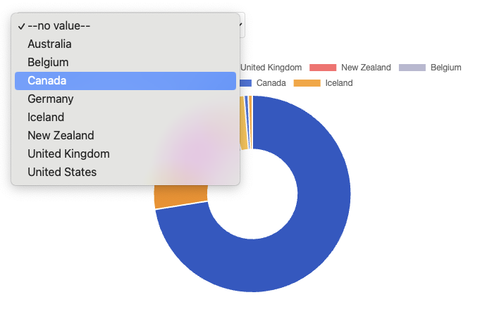
return (
<select value={value} onChange={handleChange}>
<option value={NO_VALUE}>--no value--</option>
{data.map((option, index) => (
<option key={index} value={option[values.name]}>
{option[values.name]}
</option>
))}
</select>
);
};
export default DropdownSelect;This is just a regular React <select> component. Nothing Embeddable-specific yet.
Define your companion .emb file
- In the
ExampleDropdownfolder, create a second file calledExampleDropdown.emb.ts.
touch src/embeddable.com/components/ExampleDropdown/ExampleDropdown.emb.ts- Paste the following code and save:
// src/embeddable.com/components/ExampleDropdown/ExampleDropdown.emb.ts
import {
EmbeddedComponentMeta,
Inputs,
defineComponent,
definePreview,
} from '@embeddable.com/react';
import { loadData, Value, mockDimension, mockDataResponse } from '@embeddable.com/core';
import Component from './index'; // the React component we've defined above
export const meta = {
name: 'ExampleDropdown', // this name must match the name of the file (before the `.emb.ts` part)
label: 'Example Dropdown', // human readable name for the component
category: 'Examples', // organise your components into categories
// the width and height (in px) that the component will default to when added to the canvas
defaultWidth: 320,
defaultHeight: 50,
// these are the inputs that the user of your component will be able to interact with
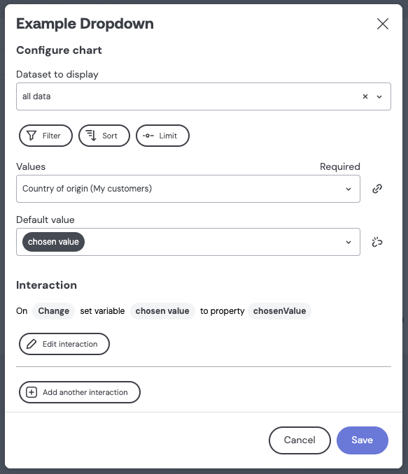
inputs: [
{
name: "ds",
type: "dataset", // this tells Embeddable to render a dropdown with the available datasets
label: "Dataset to display",
category: 'Configure chart',
description: 'The dataset to load the values from'
},
{
name: "values",
type: "dimension", // this tells Embeddable to render a dropdown with the available dimensions
label: "Values",
required: true, // users of your component will be required to provide a value for this input.
config: {
dataset: "ds", // this matches the `name` of the input above
},
category: 'Configure chart',
description: 'The choice of values'
},
{
name: 'defaultValue',
type: 'string', // this tells Embeddable to render a text input
label: 'Default value',
category: 'Configure chart',
description: 'The initial value'
},
],
events: [
{
// this tells Embeddable that this component can fire an event.
// This will mean that users of your component can define an Interaction for it (such as setting a variable).
name: 'onChange',
label: 'Change',
properties: [
{
name: 'chosenValue', // tells Embeddable that the event will have a payload of one string, called `chosenValue`
type: 'string'
}
]
}]
} as const satisfies EmbeddedComponentMeta;
export const preview = definePreview(Component, {
values: mockDimension('country', 'string', { title: 'Country' }),
results: mockDataResponse(
['country'],
[
['US'],
['GER'],
['UK'],
['FRA'],
['SPA'],
],
),
onChange: () => null
});
// `defineComponent` is what tells Embeddable that this is a component
export default defineComponent(Component, meta, {
props: (inputs: Inputs<typeof meta>) => {
return {
...inputs,
// load data from the database, based on the choice of inputs provided by the user of your component
// and put the results into a `prop` called `results`
results: loadData({
from: inputs.ds,
select: [inputs.values]
}),
};
},
events: {
// this takes the `value` passed to `onChange` in the react component, and passes it to `chosenValue` which is defined in the `events` above.
onChange: (value) => ({ chosenValue: value || Value.noFilter() })
}
});Success! Your component is ready to try out.
Test your component in Embeddable
From the root of your repo, run:
npm run embeddable:dev
This spins up a local workspace that uses your local components and models (learn more).
Add your component to a dashboard
- Create a new dashboard, or open the one you made in the previous step.
- Click the Add component button. You should now see your "Example dropdown" there!
Congratulations! You've created your first Embeddable component.
Any changes you make to your components or data models while developing locally and running embeddable:dev should cause the workspace to refresh and instantly show you the effect of those changes 🚀.
Whenever you've finished testing components locally, you can build and push them to your Embeddable workspace:
npm run embeddable:build
npm run embeddable:push
Learn more about defining components, loading data and adding interactivity.
Next Steps
🎉 Congratulations! You have completed the getting started guide, and learned about the core concepts of Embeddable!
Take a break and treat yourself! Once you're back, why not look at one of the following topics:
- Connect your database
- Create your first data model to define and manage data access
- Apply row level security so your end-users see the right data
- Set up your theme to match your brand