Defining custom types
Custom types are still in Beta:
- You may experience typescript errors when using them.
- You may need to restart
embeddable:devfor changes to take effect. - Custom types are not yet supported in Custom Canvas.
- We may make breaking changes to custom types in the future.
Out of the box, we provide you with all the standard types, like string, number, boolean, time and timeRange (we call these native types). But sometimes you'll want to create your own custom types.
E.g. here we've defined a Color type which is used as an input on a Toggle component:

The most common reason for creating a custom type is that you want to create a custom input type/UX for one or more of your components.
E.g:
- an enum of some kind, like positioning of a label (
top,bottom,left,right, etc.) - creating a
Styletype for being able to provide different look and feels (colours, fonts, border radius', etc.) to your components for different dashboards - creating more complex/powerful versions of our native types, e.g. defining your own date, number or text types.
The defineType function
The defineType function is how you define a custom type in Embeddable (on top of the built-in native types).
E.g. to define a Color type, create a file named Color.type.emb.ts (file must end in .type.emb.ts for Embeddable to pick it up) like so:
import { defineType } from '@embeddable.com/core';

const ColorType = defineType('color', {
  label: 'Color'
});

export default ColorType;
Parameters
The defineType function takes the following parameters:
| Param | Type | Required |
|---|---|---|
id | string | Yes |
properties | object | Yes |
The first parameter (in this case 'color') must be a unique identifier for the type (i.e. it cannot conflict with that of a native type). This name is used internally by Embeddable to reference the type in dashboards where it is used. Updating it once it's in use can potentially break your dashboards
The second parameter is an object that takes the following properties:
| Property | Type | Required |
|---|---|---|
label | string | Yes |
optionLabel | (object) => string | No |
cast | { [type]: (object) => any } | No |
toNativeDataType | { [type]: (object) => object } | No |
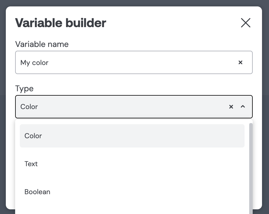
label: the human-readable name that appears in the UI. You can change it anytime without impacting the underlying logic. E.g. you can see our custom type, labeled 'Color', appearing here among the native types in the Variable Builder:
optionLabel: This tells Embeddable how to render each option of this custom type in the UI (learn more).cast: an object specifying how to convert this custom type to other Embeddable types, so variables of this type can be used in component inputs of different types (learn more).toNativeDataType: an object specifying how to map this custom type to Cube-native data types, for use in dataset filters only (learn more). For component input interoperability, usecastinstead.
The defineOption function
The easiest way to start using a custom type in Embeddable is to provide it with a few options. Think of these like an enum of choices. You can use options to statically define the values available for this custom type.
E.g. let's define 3 Color options: Orange, Red and Blue.
To do so, update our Color.type.emb.ts file to contain the following content:
import { defineType, defineOption } from '@embeddable.com/core';

const ColorType = defineType('color', {
  label: 'Color',
  optionLabel: (color) => color.name
});

defineOption(ColorType, { name: 'Orange', r: 256, g: 158, b: 84 });
defineOption(ColorType, { name: 'Red', r: 247, g: 122, b: 95 });
defineOption(ColorType, { name: 'Blue', r: 65, g: 98, b: 136 });

export default ColorType;
Parameters
The defineOption function takes the following parameters:
| Param | Type | Required |
|---|---|---|
type | CustomType | Yes |
value | object | Yes |
The first argument is the type itself (e.g. ColorType). This tells Embeddable which type you're adding the option to.
The second argument is the javascript value that represents that option (e.g. { name: 'Orange', r: 256, g: 158, b: 84 }). This is the javascript value that will get passed to a component if that option is chosen (concrete example of this below).
In the example above we're using name and r, g and b to represent our type, but we could define the shape of the object however we like. As long as the components that use this custom type know how to handle it.
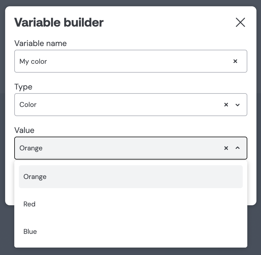
Also notice the optionLabel, on the defineType function, in the example above. This tells Embeddable how to render the option in the UI (in this case optionLabel is defined as (color) => color.name so Embeddable will use the name property from { name: 'Orange', r: 256, g: 158, b: 84 }) like so:
Using a custom type in a component
Let's look at a full example of how we can use our new Color type in a component.
Let's define a basic toggle component like this:
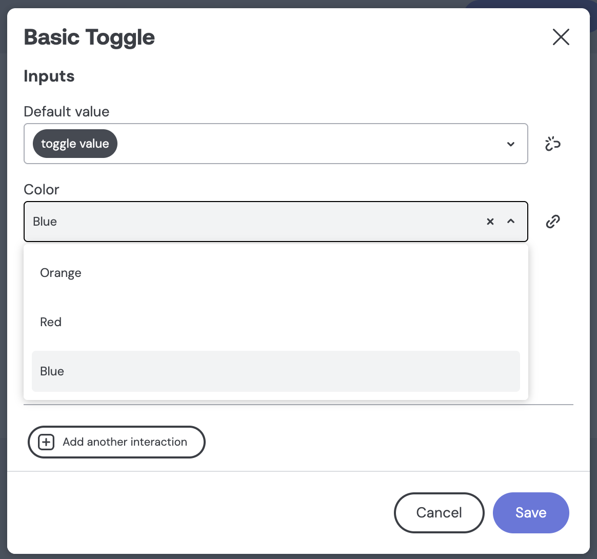
Which takes its color as in input:
To do so, we'll write a simple React component (called Toggle/index.tsx) like so:
import React, { useState, useEffect } from 'react';
import './index.css';

type Change = (boolean) => void;

export type Props = {
  defaultValue: boolean;
  onChange: Change;
  color: { r: number; g: number; b: number };
};

export default (props: Props) => {
  const { defaultValue, onChange, color } = props;
  const [checked, setChecked] = useState(defaultValue);
  useEffect(() => setChecked(defaultValue), [defaultValue]);

  const handleChange = () => {
    const newValue = !checked;
    setChecked(newValue);
    onChange?.(newValue);
  };

  return (
    <div className="toggle-container">
      <button
        className={checked ? 'on' : 'off'}
        style={{
          backgroundColor: checked ? `rgb(${color.r}, ${color.g}, ${color.b})` : undefined
        }}
        onClick={handleChange}
      >
        <span className="pin" />
      </button>
    </div>
  );
};
With some CSS to style it (in a file called Toggle/index.css) like so:
.toggle-container button {
  background-color: #555;
  border: 0;
  border-radius: 15px;
  cursor: pointer;
  height: 30px;
  position: relative;
  width: 60px;
  -webkit-appearance: none;
  -moz-appearance: none;
}

.toggle-container .pin {
  background-color: white;
  border-radius: 13px;
  height: 22px;
  left: 4px;
  position: absolute;
  top: 4px;
  width: 22px;
  transition: left ease .5s;
}

.toggle-container label {
  line-height: 20px;
  vertical-align: sub;
  padding: 5px;
  white-space: nowrap;
}

.toggle-container button.on .pin {
  left: 34px;
}
Things to notice:
- Notice that we're using the
r,gandbvalues directly inside our javascript like so:
style={{
  backgroundColor: checked ? `rgb(${color.r}, ${color.g}, ${color.b})` : undefined
}}
And then we'll tell Embeddable about the component (in a file called `Toggle/Toggle.emb.ts) like so:
import { EmbeddedComponentMeta, defineComponent, type Inputs } from '@embeddable.com/react';
import ColorType from '../../types/Color/Color.type.emb';

import Component from './index';

export const meta = {
  name: 'Toggle',
  label: 'Basic Toggle',
  inputs: [
    {
      name: 'defaultValue',
      type: 'boolean',
      label: 'Default value',
      description: 'The initial value'
    },
    {
      name: 'color',
      type: ColorType as never,
      label: 'Color',
      defaultValue: { name: 'Light blue', r: 97, g: 153, b: 243 }
    }
  ],
  events: [
    {
      name: 'onChange',
      label: 'Change',
      properties: [
        {
          name: 'value',
          type: 'boolean'
        }
      ]
    }
  ],
  variables: [
    {
      name: 'toggle value',
      type: 'boolean',
      defaultValue: true,
      inputs: ['defaultValue'],
      events: [{ name: 'onChange', property: 'value' }]
    }
  ]
} as const satisfies EmbeddedComponentMeta;

export default defineComponent(Component, meta, {
  props: (inputs: Inputs<typeof meta>) => {
    return {
      ...inputs
    };
  },
  events: {
    onChange: (value) => ({ value })
  }
});
Things to notice:
- We've imported our
Colortype like so:
import ColorType from '../../types/Color/Color.type.emb';- We're using it to define our input like so:
{
  name: 'color',
  type: ColorType as never,
  label: 'Color',
  defaultValue: { name: 'Light blue', r: 97, g: 153, b: 243 }
}- We're passing the value of all the
inputsto our react component (asprops) here:
props: (inputs: Inputs<typeof meta>) => {
	return {
	  ...inputs
	};
},- Which is why they're available inside our React component:
export type Props = {
  defaultValue: boolean;
  onChange: Change;
  color: { r: number; g: number; b: number };
};- To set the value of our type, we use the same shape as used by our options:
defaultValue: { name: 'Light blue', r: 97, g: 153, b: 243 }
So now we can customize the color of our Toggle component directly in Embeddable:
The defineEditor function
The fastest way to use custom types is to use defineOption (as demonstrated above) as it automatically makes this type available as a dropdown of the available options:
But sometimes you want to provide a more flexible way of using custom types in the Embeddable builder. This is where defineEditor comes in. It allows you to use React.js to define your own editor component for that type.
E.g. let's define a very basic RGB (Red-Green-Blue) editor for our Color type:
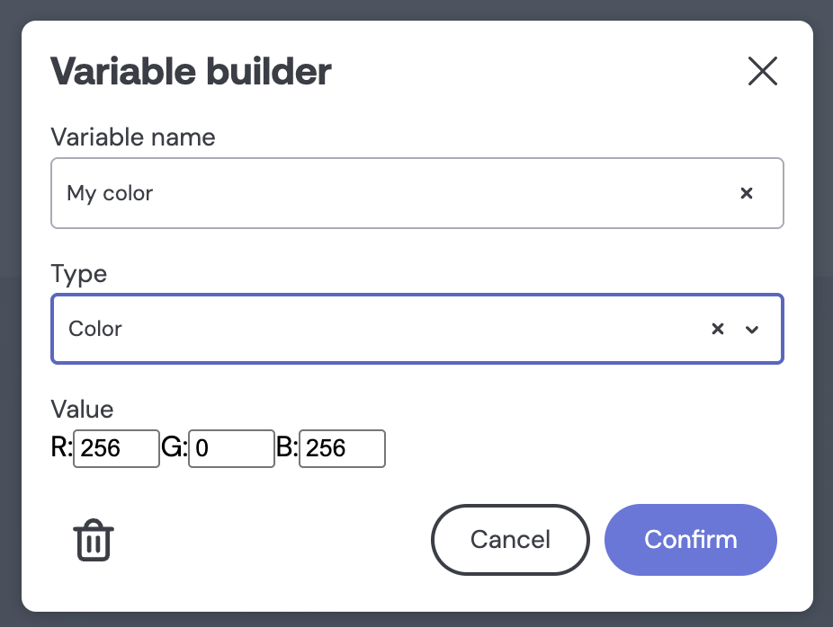
It will allow builders to define their colors using custom RGB values, both in the Variable builder (shown above) and inside components themselves, like so:
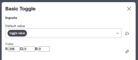
To do this, let's define our React component (let's call it ColorEditor/index.tsx):
import React, { useState, useEffect } from 'react';

type Color = { name: string; r: number; g: number; b: number };
type Change = (color: Color) => void;

type Props = {
  value: Color;
  onChange: Change;
};

const ColorInput: React.FC<Props> = ({ value, onChange }) => {
  const [color, setColor] = useState<Color>(value || { name: '', r: 0, g: 0, b: 0 });

  useEffect(() => {
    onChange(color);
  }, [color, onChange]);

  const handleChange = (
    newValue: string,
    component: keyof Omit<Color, 'name'>
  ) => {
    let numericValue = parseInt(newValue, 10) || 0;
    numericValue = Math.min(Math.max(numericValue, 0), 256);

    const updated = { ...color, [component]: numericValue };
    updated.name = `${updated.r},${updated.g},${updated.b}`;
    setColor(updated);
  };

  return (
    <div>
      <label>
        R:
        <input
          type="number"
          min="0"
          max="256"
          value={color.r}
          onChange={(e) => handleChange(e.target.value, 'r')}
        />
      </label>
      <label>
        G:
        <input
          type="number"
          min="0"
          max="256"
          value={color.g}
          onChange={(e) => handleChange(e.target.value, 'g')}
        />
      </label>
      <label>
        B:
        <input
          type="number"
          min="0"
          max="256"
          value={color.b}
          onChange={(e) => handleChange(e.target.value, 'b')}
        />
      </label>
    </div>
  );
};

export default ColorInput;
And then tell Embeddable about it (in a file called ColorEditor/ColorEditor.emb.ts) like so:
import { defineEditor } from "@embeddable.com/react";
import ColorType from "../../Color.type.emb.ts";
import { Value } from "@embeddable.com/core";

import Component from "./index";

export const meta = {
  name: "ColorEditor",
  label: "Color Editor",
  type: ColorType,
};

export default defineEditor(Component, meta, {
  inputs: (value, setter) => {
    return ({
      value,
      onChange: (val) => setter(Value.of(val)),
    });
  }
});
Parameters
The defineEditor function tells Embeddable that a custom editor exists for a given custom type.
It must be called from inside a file named <EditorName>.emb.ts and it must export the editor (see example above).
It takes the following parameters:
| Param | Type | Required |
|---|---|---|
component | ReactComponent | Yes |
meta | Meta | Yes |
inputs | Inputs | Yes |
componentis the React component that should be used as the editor for this custom type.metaandinputsare described below.
Meta contains the following properties:
| Property | Type | Required |
|---|---|---|
name | string | Yes |
label | string | Yes |
type | CustomType | Yes |
nameis the name of this editor. It must match the name of the file (e.g.<EditorName>.emb.ts)labelis not currently used, but may be used in the future if we add support for multiple editors per type.typetells Embeddable which custom type that this editor should be an editor for.
Inputs contains only one property:
| Property | Type | Required |
|---|---|---|
inputs | (value, setter) => object | Yes |
- Whatever
inputsreturns is what will be passed as thepropsto our React component. - The
setteris the function that must be called to update the value of the custom type (the value passed to it must match the shape expected by the type, e.g.setter(Value.of({ r: 97, g: 153, b: 243 }))) - The
valuetells us the current value of our custom type.
We should now be able to use our custom editor like so:
Casting between types
By default, a variable can only be connected to component inputs that expect the same type. Casting lets you define how your custom type converts to other Embeddable types — so a dashboard builder can, for example, connect a Color variable to a component input that expects a string.
To enable this, add a cast property to your type definition:
import { defineType, defineOption } from '@embeddable.com/core';

const ColorType = defineType('color', {
  label: 'Color',
  optionLabel: (color) => color.name,
  cast: {
    string: (color) => color.name
  }
});
This tells Embeddable that a Color variable can be used anywhere a string is expected. When it is, the value is automatically converted using your function before being passed to the component.
You can define casts to multiple types:
cast: {
  string: (color) => color.name,
  number: (color) => color.r + color.g + color.b
}cast works for component inputs. If you also need your custom type to work in dataset filters, you'll need toNativeDataType too — see below.
Using custom types to filter datasets
If you want a custom type variable to also work in dataset filters (not just component inputs), you need to tell Embeddable how to convert your custom type into a Cube-native data type. This is a separate concern from cast, which handles component input compatibility.
This will make your custom types available in the "Dataset builder" filters like so:
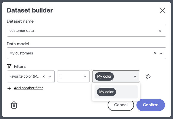
To do this, define toNativeDataType on your type:
import { defineType, defineOption } from '@embeddable.com/core';

const ColorType = defineType('color', {
  label: 'Color',
  optionLabel: (color) => color.name,
  toNativeDataType: {
    string: (color) => color.name
  }
});

export default ColorType;
This tells Embeddable that our Color type can be used anywhere where a string variable can normally be used.
You can define as many mapping as you feel make sense:
toNativeDataType: {
  string: (color) => color.name,
  number: (color) => color.r + color.g + color.b,
  boolean: (color) => color.r > color.g
}
These mappings, obviously, don't really make sense ... but I hope you get the idea.