The defineComponent Function
The defineComponent function, used inside your emb.ts files, is how you register and configure components in Embeddable. It tells Embeddable that this component should be available in the no-code builder to add to the Embeddable canvas.
export default defineComponent(Component, meta, {
  props: (inputs: Inputs<typeof meta>) => {
    return {
      ...inputs, // the inputs are passed through to the component as props
      results: loadData({ ... }), // fetches data from your database and passes it to your component
    };
  },
});
Parameters
When you call defineComponent in your .emb.ts file, you pass in three arguments:
| Param | Type | Required |
|---|---|---|
component | Component | ✅ Yes |
meta | Meta | ✅ Yes |
config | Config | ✅ Yes |
component: your React component.meta: an object defining how the component appears and which inputs are available in the builder.config: an object specifying how user inputs map to props, how local state is managed, and how events are handled.
1. component
component is simply your React component:
import Component from './index';2. meta
meta is the second argument to defineComponent. It governs how a component is displayed and configured in the builder, including the inputs it needs.
  import { EmbeddedComponentMeta } from '@embeddable.com/react';

  export const meta = {
    name: 'MyComponent',
    label: 'My Component',
    category: 'Charts',
    classNames: ['container'],
    defaultWidth: 200,
    defaultHeight: 100,
    inputs: [...],
    events: [...],
    variables [...],
} as const satisfies EmbeddedComponentMeta;| Param | Type | Required |
|---|---|---|
name | string | ✅ Yes |
label | string | ✅ Yes |
classNames | string[] | ❌ No |
defaultWidth | number | ❌ No |
defaultHeight | number | ❌ No |
inputs | InputMeta[] | ❌ No |
events | EventMeta[] | ❌ No |
variables | VariableMeta[] | ❌ No |
name: A unique identifier that must match the.emb.tsfilename. Changing it later can break references.label: A user-facing name shown in the builder.classNames: CSS class names for styling the container.inputs: Input fields users configure (e.g.strings,numbers,datasets, as well as custom types).defaultWidth/defaultHeight: Initial size in the builder (in pixels, snapped to a grid).events: Specifies events the component can trigger (e.g.onChange,onClick), which is key to interactivity. Learn more about events here.variables: Auto-creates variables in the no-code Builder when the component is used, which are key to interactivity. Learn more about variables here.
InputMeta definition
export const meta: EmbeddedComponentMeta = {
    name: 'BasicDropdownComponent',
    label: 'Basic Dropdown',
    inputs: [
        {
            name: 'ds',
            type: 'dataset',
            label: 'Dataset',
            description: 'Dataset',
            category: 'Dropdown values',
            required: true
        },
        {
            name: 'property',
            type: 'dimension',
            label: 'Property',
            config: {
              dataset: 'ds',
              supportedTypes: ['time'] // Only let user pick time dimensions
            },
            category: 'Dropdown values'
        },
        ...
    ]
}| Param | Type | Required |
|---|---|---|
name | string | ✅ Yes |
type | CustomType or NativeType | ✅ Yes |
label | string | ✅ Yes |
description | string | ❌ No |
defaultValue | any | ❌ No |
config | object | ❌ No |
array | boolean | ❌ No |
category | string | ❌ No |
required | boolean | ❌ No |
inputs | SubInputMeta[] | ❌ No |
name: A unique identifier for this input (within the component).type: Determines the UI control (e.g.,string,dimension, or custom). Native types are described below.label: User-facing label in the builder.description: A helpful reference, not currently displayed in the builder.defaultValue: The initial value for the input.category: Assigns an optional grouping for this input in the builder UI. Inputs sharing the same category appear together.required: Tells Embeddable that a value must be provided for this input in order to use this component. Defaults tofalse.config: An arbitrary JS object that is type-specific. Theconfigobject is passed to the no-code editor to enable custom behavior. A common use-case includes specifying the dataset fordimensionormeasureinputs and limiting the options that display based on their type.array: Allows users in the builder to select or add multiple values. Applies to inputs of typedimension,measure, andstring.inputs: allows you to define sub-inputs for a given input. Can only be applied to inputs oftype"dimension", "measure", or "dimensionOrMeasure". And only ifarrayis set totrue. Learn more below.
SubInputMeta definition
Sub inputs allow you to define additional inputs per dimension or measure chosen by the user of your component. E.g. in the example below we're defining a standard table component, where one chooses the columns to show. But for each column we have defined additional inputs that the user will be shown. E.g. all columns will have a "Column name" sub input for overriding the column name. Dimensions of type time will have a "Date format" sub input. And string columns will have a "prefix" sub input.
export const meta: EmbeddedComponentMeta = {
    name: 'MyTable',
    label: 'Table component',
    inputs: [
        {
            name: 'ds',
            type: 'dataset',
            required: true
        },
        {
            name: 'columns',
            type: 'dimensionOrMeasure',
            label: 'Columns',
            array: true,
            inputs: [
              {
                name: 'columnName',
                type: 'string',
                label: 'Column name',
                description: 'The label to show on this column',
                required: true
              },
              {
                name: 'dateFormat',
                type: 'string',
                label: 'Date format',
                supportedTypes: ['time'],
                defaultValue: 'yyyy-MM-dd'
              },
              {
                name: 'prefix',
                type: 'string',
                supportedTypes: ['string']
              }
            ]
            config: {
              dataset: 'ds',
            }
        },
        ...
    ]
}| Param | Type | Required |
|---|---|---|
name | string | ✅ Yes |
type | CustomType or NativeType | ✅ Yes |
label | string | ✅ Yes |
description | string | ❌ No |
defaultValue | any | ❌ No |
config | object | ❌ No |
required | boolean | ❌ No |
supportedTypes | string[] | ❌ No |
name: A unique identifier for this sub input (within the component).type: Determines the UI control (e.g.,string,dimension, or custom). Native types are described below.label: User-facing label in the builder.description: A helpful reference, not currently displayed in the builder.defaultValue: The initial value for the sub input.required: Tells Embeddable that a value must be provided for this input in order to use this component. Defaults tofalse.config: An arbitrary JS object that is type-specific. Theconfigobject is passed to the no-code editor to enable custom behavior.supportedTypes: tells Embeddable which type ofdimensionormeasurethis sub input should be applied to (e.g.['string', 'time']). If omitted, this sub input will be shown on all dimensions and measures.
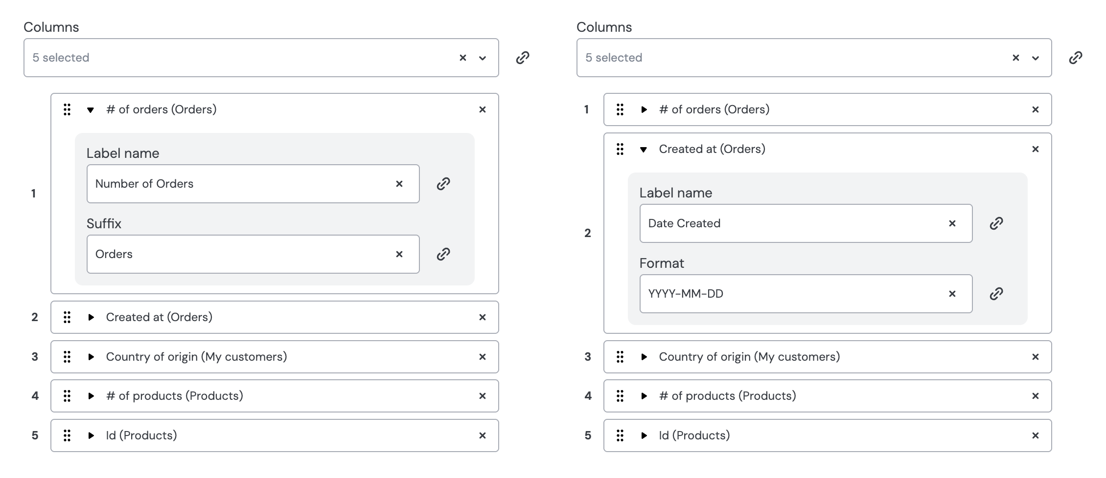
Inputs that contain sub inputs will contain an additional expandable section in the no-code builder, as shown here:
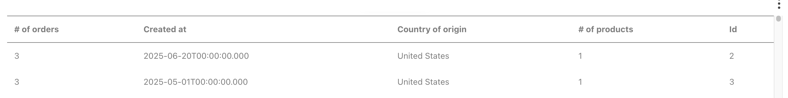
These values are then passed to your component along with the other input props, and can be used within the component to customize behavior. Here's an example of a table with no sub inputs set:
And here's the same table using the sub inputs defined in the screenshot of the no-code builder above:
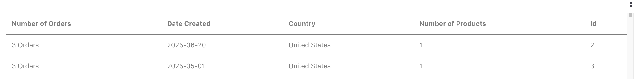
Notice that multiple column headers have been adjusted, an "Orders" suffix has been added to values in the first column, and the date format has been changed to something much more readable.
Native Input Types
When defining inputs in your .emb.ts file, you can select from a set of native types that Embeddable supports by default. Each type dictates which UI control appears in the no-code builder and how the data is passed to your component.
stringrenders a text input in the builder.numberrenders a numeric input in the builder.booleanrenders a dropdown (true/false) in the builder.timerepresents a single point in time, either absolute or relative.// Absolute date const t1: Time = { date: new Date(1980, 3, 28) } // Relative date const t2: Time = { relativeTimeString: 'last week' }timeRangerepresents a range between two time points, either absolute or relative.// Absolute from / to const tr1: TimeRange = { from: new Date(1995, 1, 16), to: new Date() } // Relative const tr2: TimeRange = { relativeTimeString: 'last 30 days' }datasetlets users pick a dataset in the builder.measurerepresents a measure (count, sum, etc.), as defined in your data models.dimensionrepresents a dimension (e.g. group by country or category), as defined in your data models.granularityfor grouping time dimensions inloadData.const g: Granularity = 'day' // or 'week', 'month', 'year', etc.dimensionOrMeasurerepresents an input that can be either a dimension or a measure, letting the user choose in the builder.
If you need more specialized behavior than these native types provide (e.g., custom date pickers or advanced styling), you can define custom types along with a custom editor. These built-in types, however, cover most standard use cases for text, numbers, booleans, time inputs, and data references.
EventMeta definition
Events are used to create interactive components. For example, a dropdown containing a list of countries that, when clicked, filters the data. Or a set of buttons showing 'day', 'week', and 'month' that, when clicked, update the x-axis granularity on a time-series chart.
export const meta: EmbeddedComponentMeta = {
    name: 'BasicDropdownComponent',
    label: 'Basic Dropdown',
    inputs: [...],
    events: [
        {
            name: 'onChange',
            label: 'Change',
            properties: [
                { name: 'value', type: 'string', label: 'Clicked Dimension' },
            ],
        },
    ]
}| Param | Type | Required |
|---|---|---|
name | string | ✅ Yes |
label | string | ✅ Yes |
properties | EventProperty[] | ❌ No |
-
name: The event handler name passed into your React component. E.g. setting it toonBigClickmeans that Embeddable will inject a function into your React component, via its props, calledonBigClick. When called, the value you pass to this function will be passed toevents.onBigClickinsidedefineComponentwhere you need to map the value onto anobjectthat has the shape described inevents.propertiesin yourmeta. This allows Embeddable to make your event available to use as an interaction in the no-code builder. -
label: How this event is labeled in the builder. -
properties: Describes data passed to Embeddable when the event fires.EventPropertydefinition
| Param | Type | Required |
|---|---|---|
name | string | ✅ Yes |
type | CustomType or NativeType | ✅ Yes |
label | string | ❌ No |
array | boolean | ❌ No |
name: The property key in youreventsmapping (e.g.value).type: The expected data type (e.g.string,number,boolean).label: An optional label for this property in the builder.array: Allows multiple values if set totrue.
VariableMeta definition
Variables are a core-concept in Embeddable. They are used mainly to store the values passed to Embeddable from events fired by interactive components.
Variables can be created manually in the no-code builder or they can be defined in code and then created automatically. Defining them in code is preferable because it contributes to a faster, more intuitive experience within the builder - especially for non-technical users.
export const meta: EmbeddedComponentMeta = {
    name: 'BasicDropdownComponent',
    label: 'Basic Dropdown',
    inputs: [...],
    events: [...],
    variables: [
        {
            name: 'chosen value',
            type: 'string',
            defaultValue: Value.noFilter(),
            inputs: ['defaultValue'],
            events: [{ name: 'onChange', property: 'value' }],
        },
    ]
}| Param | Type | Required |
|---|---|---|
name | string | ✅ Yes |
type | CustomType or NativeType | ✅ Yes |
defaultValue | any | ❌ No |
inputs | string[] | ❌ No |
events | EventRef[] | ❌ No |
-
name: The variable’s name when auto-created in the builder. -
type: The variable type (string,boolean, etc.). -
defaultValue: The initial value for the variable. -
inputs: A list of inputs whose value should be linked to the variable. The names must match the name of an input defined ininputs.namein yourmeta. -
events: If you want certain events to update this variable’s value.EventRefdefinitionParam Type Required namestring ✅ Yes propertystring ✅ Yes name: References an event frommeta.events.property: References a property in that event (e.g.,{ name: 'onChange', property: 'value' }).
3. config
config is the third argument to defineComponent. It controls what's passed to your component as props and how local .emb state (Embeddable State) is managed.
| Param | Type | Required |
|---|---|---|
props | (inputs: Inputs<typeof meta>, [state, setState], clientContext) => any | ✅ Yes |
events | { [eventName: string]: (payload: any) => any } | ❌ No |
props(inputs, [state, setState], clientContext)-
inputs: Values entered by the user in the no-code builder. -
stateandsetStateare state local to the.embfile, enabling you to pass state from your react component back to the.emb.file. The most common use-case is to load data dynamically from within the component. -
clientContext: Any additional data passed in from the web component at embed time (e.g. theming, environment info).export default defineComponent(MyComponent, meta, { props: (inputs, [state, setState], clientContext) => { return { ...inputs, clientContext, // e.g. { theme: 'dark', locale: 'en-US' } }; } });
-
eventsdescribes how events your component triggers are transformed into a data object that Embeddable can use for interactivity, as described inevents.propertiesinmeta.
A Detailed Example
// src/components/Buttons/Buttons.emb.ts

import { Value } from '@embeddable.com/core';
import { EmbeddedComponentMeta, Inputs, defineComponent } from '@embeddable.com/react';

import Component from './index';

export const meta = {
  name: 'Buttons', // Must match the .emb.ts filename; unique ID for this component
  label: 'Button List', // User-facing name in the builder UI
  defaultWidth: 400, // Initial width in pixels when dropped on the canvas
  defaultHeight: 80, // Initial height in pixels when dropped on the canvas
  category: 'Controls: buttons', // Optional grouping/category in the builder

  inputs: [
    {
      name: 'values',
      type: 'string',
      array: true, // Allows multiple string values (multi-select)
      label: 'Values',
      category: 'Button values' // Groups these inputs in the builder UI
    },
    {
      name: 'title',
      type: 'string',
      label: 'Title',
      category: 'Settings' // Another input category for organizational purposes
    },
    {
      name: 'selectedValues',
      type: 'string',
      array: true,
      label: 'Default value',
      category: 'Pre-configured variables'
    }
  ],

  events: [
    {
      name: 'onChange', // Event name your React component expects as a prop
      label: 'Change', // How this event appears in the builder UI when defining interactions
      properties: [
        {
          name: 'value', // The property name to be passed back
          type: 'string',
          array: true // Indicates multiple string values can be returned
        }
      ]
    }
  ],

  variables: [
    {
      name: 'chosen value', // Variable created automatically when this component is added
      type: 'string',
      array: true,
      defaultValue: Value.noFilter(), // Initial variable value (if none provided)
      inputs: ['selectedValues'], // Connects the variable to the 'selectedValues' input
      events: [{ name: 'onChange', property: 'value' }] // On the 'onChange' event, update the 'chosen value' variable with the 'value' property from the event
    }
  ]
} as const satisfies EmbeddedComponentMeta;

export default defineComponent(Component, meta, {
  props: (inputs: Inputs<typeof meta>, [state], clientContext) => {
    // Maps the inputs defined in meta to the props of your React component
    return {
      ...inputs,
      clientContext // e.g. { theme: 'dark', locale: 'en-US' }
    };
  },
  events: {
    // Maps the 'onChange' event from your React component to an event described in meta
    onChange: (v) => ({ value: v || Value.noFilter() })
  }
});