Quick-start styling guide
If you want to get set up quickly, follow these steps to style the key elements of Remarkable Pro.
We recommend spinning up your local environment while making these changes so you can see the impact of each adjustment in real time.
Open your theme file
- Open
embeddable.theme.tsinside your repo. - Add an empty
stylesobject to a new or existing theme.
//embeddable.theme.ts

export const themeProvider = (clientContext: any, parentTheme: Theme): Theme => {

    const myTestStyles: DeepPartial<Theme> = {
        styles: {
            //your style overrides will go here
        }
    }

    return defineTheme(parentTheme, myTestStyles) as Theme;
};
Set the basics: text and surfaces
Update these semantic tokens to control text color and background surfaces across Remarkable.
// theme.styles

styles: {
  // Text
  '--em-sem-text': '#000', // Primary text: titles, labels, values, tooltips, icons
  '--em-sem-text--muted': '#888', // Secondary text: descriptions, axes, legends, subtle UI

  // Backgrounds
  '--em-sem-background': '#fff', // Chart Cards and hover surfaces
  '--em-sem-background--neutral': '#ccc', // Panels, selects, table-chart surfaces

}
Now we’ll look at component-level overrides. These let you customise specific elements without changing your global theme.
Chart Cards
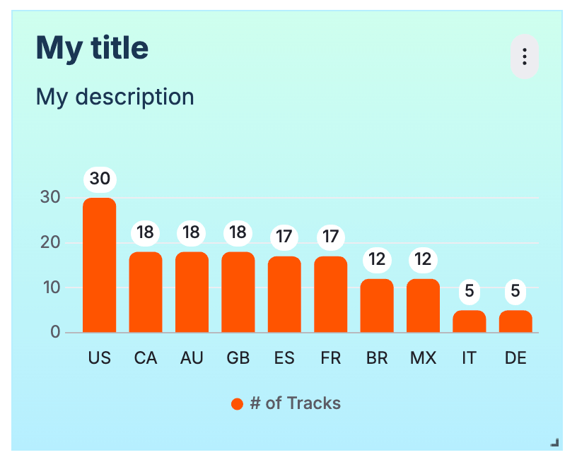
- Chart Cards are the background surface for each chart widget.
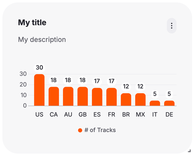
- The left image above shows the default card.
- The right image overrides the card styling using these tokens:
//Card
"--em-card-background": "linear-gradient(180deg, #CEFFEE 0%, #B6EEFF 100%)", // default: var(--em-sem-background)
"--em-card-border-radius": "0px",
"--em-card-border-color": "#B6EEFF",
"--em-card-border-width": "1px",
"--em-card-padding": "16px"

//Card title
"--em-card-title-color": "#1A3553", // default: var(--em-sem-text)
"--em-card-title-font-size": "22px",
"--em-card-title-font-weight": "bold",

//Card subtitle
"--em-card-subtitle-color": "#1A3553", // default: var(--em-sem-text--muted)
"--em-card-subtitle-font-size": "16px",
"--em-card-subtitle-font-weight": "normal", - See the full list of Card tokens.
- You can customise Card styling by overriding these tokens directly (affects only Cards) or by updating the tokens they reference (e.g.
--em-sem-textor--em-sem-text--muted).
Action Icon
- The Action Icon is the icon that appears in the top right of the chart Card.
- The left image above shows the default Action Icon.
- The right image overrides the styling using these tokens:
"--em-actionicon-background": "#0F2A44", // default: var(--em-sem-background--light)
"--em-actionicon-background--hover": "#0B2E4A",
"--em-actionicon-color": "#fff", // default: var(--em-sem-text)
"--em-actionicon-border-radius": "100px",
"--em-actionicon-width": "36px",
"--em-actionicon-height": "36px",- See the full list of Action Icon tokens.
Select Fields
- Select Fields are used for most editors e.g. date / granularity / dimension selectors.
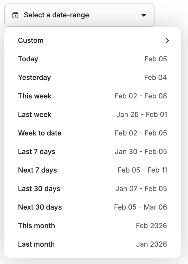
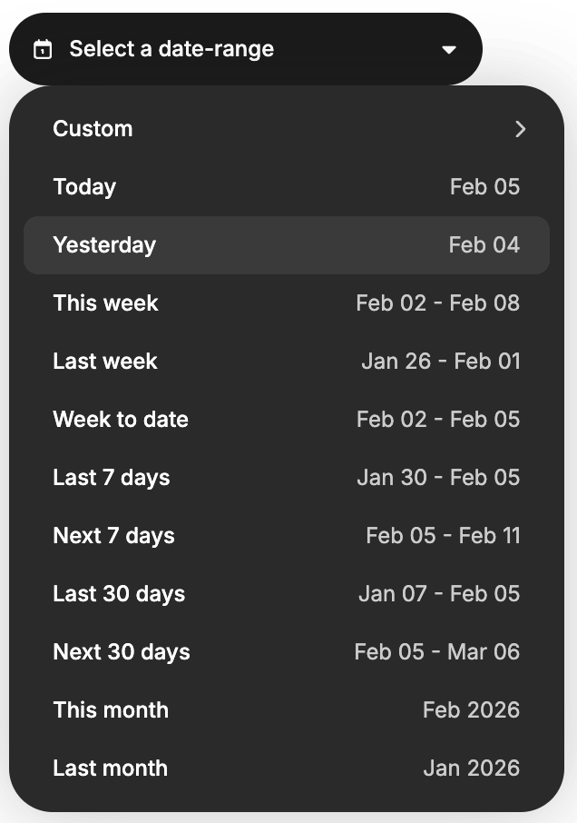
- The left image above shows the default Select Field styling (for a date selector).
- The right image overrides the styling using these tokens:
//trigger i.e. the dropdown button
"--em-selectfield-trigger-background": "#1A1A1A", // default: var(--em-sem-background--neutral)
"--em-selectfield-trigger-background--active": "#2A2A2A", // default: var(--em-sem-background--light)
"--em-selectfield-trigger-background--hover": "#2A2A2A", // default: var(--em-sem-background)
"--em-selectfield-trigger-border-width": "0px",
"--em-selectfield-trigger-border-radius": "24px",
"--em-selectfield-trigger-color": "#fff",

//content i.e. the dropdown panel
"--em-selectfield-content-background": "#2A2A2A", // default: var(--em-sem-background--neutral)
"--em-selectfield-content-border-radius": "24px",

//dropdown items
"--em-selectfield-item-background": "#2A2A2A", // default: var(--em-sem-background--neutral)
"--em-selectfield-item-background--hover": "#3A3A3A", // default: var(--em-sem-background--light)
"--em-selectfield-item-label-left-color": "#fff", // default: var(--em-sem-text)
"--em-selectfield-item-label-right-color": "#ccc", // default: var(--em-sem-text--muted)
"--em-selectfield-item-icon-color": "#ccc" // default: var(--em-sem-text)- See the full list of Select Feld tokens.
Refining individual components
Once the basics are in place, you can start making more specific adjustments. Most teams do this gradually as they get familiar with the system.
A few tips to help you dig deeper:
- Visit the full list of component-specific tokens.
- Use Storybook (opens in a new tab) to preview components in isolation and test different styling overrides.
- Refer to the Figma files (opens in a new tab) for naming, hierarchy, and intended design behaviour—Figma and the token structure are tightly aligned.
- Explore the Remarkable Pro showcase (opens in a new tab) to see all tokens applied to each component in a live environment—it's the best way to understand what each token controls.
With these tools, you can fine-tune styles on a per-component basis and get as granular as you need, without losing the consistency provided by your broader theme.