Embeddable Quick Hits - Dashboards as Code & Claude Skills
this document is transcribed from the video and therefore at times makes reference to things you can see on screen.
Hi, welcome to Embeddable Quick Hits. In this video, we’re going to talk about Embeddable’s Dashboards as Code feature, and how you can use it with Claude Code to scaffold your dashboards at lightning speed. Let’s get started!
Dashboards as Code allows you to create and update Embeddables right from your repo, without using the no-code builder. From adding components and setting up inputs, to sizing and positioning, to Embeddable Custom Canvas, if you can do it in the builder, you can do it in code. Today, we’re going to create a dashboard with a simple YAML file, and then we’re going to use the Claude skill that Embeddable provides to rapidly make some changes and enhancements to the dashboard.
We begin with the Remarkable-Pro Boilerplate Repository. If you’ve followed any of our instructions for setting up your workspace, you should already have this. If you haven’t made it that far yet, we suggest running through the getting started documentation (opens in a new tab) before circling back to this video!
We’re going to create a new YAML file. We recommend keeping these in /src/embeddable.com/dashboards but as long as the file ends in .embeddable.yml it should be picked up by the builder regardless of location. I’m going to name my file sample1.embeddable.yml. From here we could have Claude do most of the work, but let’s start by doing things manually so we understand what’s happening before turning things over to the robot overlords.
We’re going to build a simple Embeddable with two KPIs and a bar chart. Nothing fancy. We’ll use the default Spotify data models that Embeddable comes with, but this would apply to your own models as well. We’ll need three things: a basic set of dashboard data, a list of datasets, and a list of widgets (which is how we refer to components in the YAML). We could also add variables, interactions, custom canvas directives, and more, but for this tutorial we’re keeping things simple.
Let’s start with the basics:
embeddables:
  - name: sample-dashboard-1 # Cannot contains spaces
    title: Sample Dashboard 1 # Can contain spaces, shown in the workspace
    description: Our basic sample dashboard for Embeddable Quick Hits
    datasets:
    widgets:
Pretty uncomplicated, right? The most important thing to remember is that in YAML, indentation really matters, so you’ll need to follow the layout in this code exactly in order to keep things working. With that in mind, let’s create a dataset by adding a few items below that line:
    datasets:
      - name: Daily Listens # referenced by widgets and customCanvas
        model: daily_listens # must exist in your repo or a dependency
That’s all we need. We could add filters here but, again we’re trying to keep this simple. Let’s move on to the actual components. Underneath the widgets line we’re going to create our first KPI chart. This one’s not too complex:
		widgets:
      - component: KpiChartNumberPro
        position:
          x: 0
          y: 0
        dimensions:
          width: 4
          height: 12
        inputs:
          - input: dataset
            inputType: dataset
            valueType: VALUE
            value: Daily Listens
          - input: measure
            inputType: measure
            valueType: VALUE
            value: daily_listens.total_daily_listens
            config:
              dataset: dataset
          - input: title
            inputType: string
            valueType: VALUE
            value: 'Total Listens'
This tells the builder to use the KPI Chart Number Pro component, position it at the top left, and make if 4 units wide (which is one third of the dashboard width) and 12 units tall. You’ll get a feel for heights as you work with Dashboards as Code more, but 4x12 units works out to “a decent sized KPI chart”. We then give it a handful of inputs: we configure the dataset, the measure to be displayed, and the title to display above that measure. Note that we’re seeing a lot of valueType: VALUE lines. The other option for valueType is VARIABLE but that’s outside the scope of this tutorial. You can always check out our documentation for full details (opens in a new tab).
Let’s add a second KPI widget. This goes directly below the first (a line break for padding and readability is totally fine) and should be on the same indent level inside of the widgets section. It looks like this:
      - component: KpiChartNumberPro
        position:
          x: 4
          y: 0
        dimensions:
          width: 4
          height: 12
        inputs:
          - input: dataset
            inputType: dataset
            valueType: VALUE
            value: Daily Listens
          - input: measure
            inputType: measure
            valueType: VALUE
            value: daily_listens.streaming_royalties
            config:
              dataset: dataset
              inputs:
                - input: currency
                  valueType: VALUE
                  value: 'USD'
                - input: decimalPlaces
                  valueType: VALUE
                  value: 2
          - input: title
            inputType: string
            valueType: VALUE
            value: 'Total Royalty Revenue'
This is very similar to our first KPI but there’s two important things to note. The first is that while the dimensions are the same, the component is positioned at x: 4. This makes sense since the first component starts at x: 0 and is four units wide, so units 0, 1, 2, and 3 will be filled up by the first KPI. The second KPI will start at unit 4 and then also take up 5, 6, and 7. We’re not going to put anything in units 8 through 12 in this tutorial, at least not on this same horizontal line, but you absolutely could.
The second thing to note is that we’ve added sub-inputs to our measure. This is because we want to specify that the measure is a currency in US Dollars and that it should always display two decimal places, even if the value is something like 4.00 or 4.10. We don’t want that to just display, for example $4.1 as that’s not how US currency is typically shown.
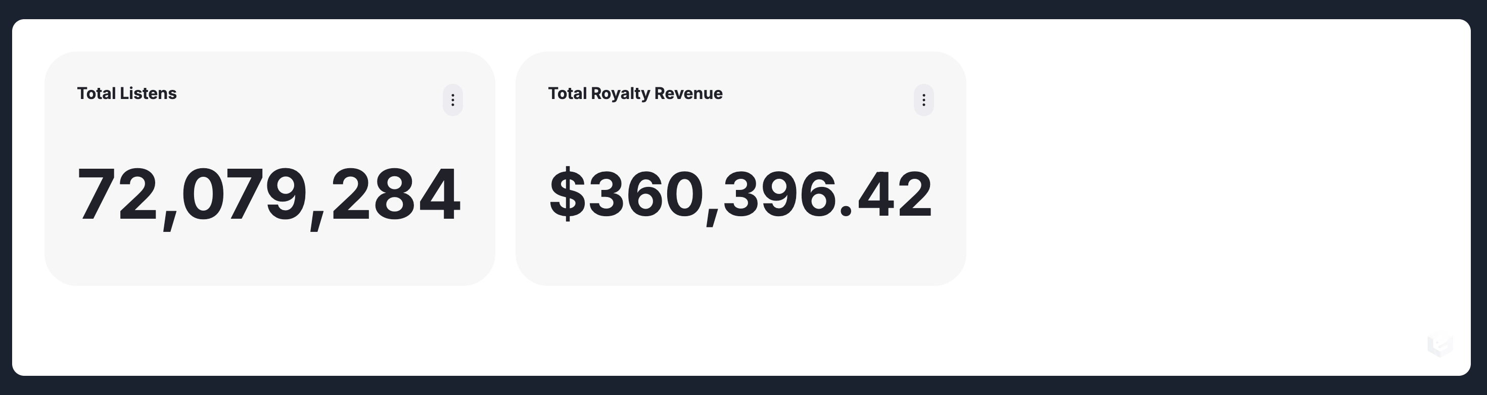
Let’s save our file and take a look at our dashboard. I’ve already got my development server running, so changes have automatically happened in my browser as we updated the file. I just need to switch over and, voila, we have two KPI components! Nice.
Let’s add that bar chart. Back to VS Code!
Again, on the same indentation level below widgets, add the following:
      - component: BarChartDefaultPro
        position:
          x: 0
          y: 12
        dimensions:
          width: 12
          height: 15
        inputs:
          - input: dataset
            inputType: dataset
            valueType: VALUE
            value: Daily Listens
          - input: measures
            inputType: measure
            valueType: VALUE
            array: true
            value:
              - daily_listens.total_daily_listens
            config:
              dataset: dataset
          - input: dimension
            inputType: dimension
            valueType: VALUE
            value: daily_listens.listened_date
            config:
              dataset: dataset
              inputs:
                - input: granularity
                  value: 'month'
                  valueType: VALUE
          - input: title
            inputType: string
            valueType: VALUE
            value: 'Total Daily Listens Over Time'
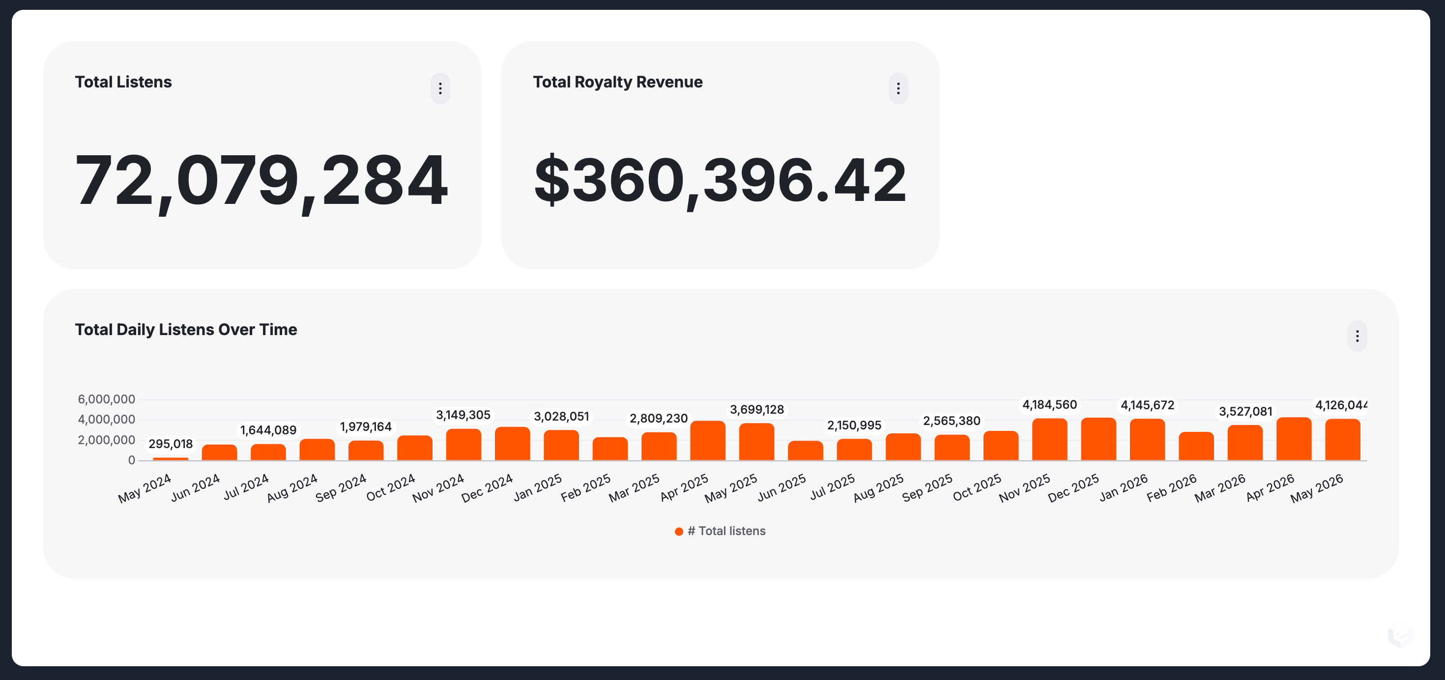
As you can see from the position values, we’re starting this one back on the left, but bumped down below the two KPI components. It’s worth noting that the width and height values start at 1, while the position values start at zero. This is why our y position is 12 … because the KPIs are twelve units tall, but since their position starts at 0, that means they end at 11. So the barchart starts immediately after that, at 12.
We’re using the same dataset and even the same measure as the first KPI but using a dimension of listened_date, which will give us a chart organized by date. We use the config option on this input to set a granularity of month which will cause the chart to render one bar per month rather than, for example, a bar per day.
Save the file and let’s switch back to our browser. It’s auto-reloaded again, and now we can see the bar chart underneath our KPIs.
From here, we’re going to let Claude take over. I’m going to do two things. The first is I’m going to squeeze the bar chart to half-width and turn it into a line chart. The second is I’m going to add a pie chart breaking down listens by age group. We’re going to do that by telling Claude exactly what we want, and letting it do the work. I use the VS Code plugin, but you could do this via the command line, web UI, or however you prefer to access agents. Here’s my prompt:
I'd like to reduce the bar chart width by half, and I'd like to convert the bar chart to a line chart. Please update it the YAML file using the appropriate Remarkable Pro component. Once that's done, please add a pie chart in the newly emptied space to the right of the line chart. This pie chart should break down total listens by the age group dimension.Claude will do its thing, reading the existing dashboard and the skill files for context before making any changes. It will dive into the component code as necessary to get a picture of how they work, and then generate the YAML accordingly. I’ve sped this up in editing, but it took less than two minutes to figure things out, and that’s starting from fresh context. If it’s already made some edits, it’s even faster.
Here’s what it changed the bar chart to:
      - component: LineChartDefaultPro
        position:
          x: 0
          y: 12
        dimensions:
          width: 6
          height: 15
        inputs:
          - input: dataset
            inputType: dataset
            valueType: VALUE
            value: Daily Listens
          - input: measures
            inputType: measure
            valueType: VALUE
            array: true
            value:
              - daily_listens.total_daily_listens
            config:
              dataset: dataset
          - input: xAxis
            inputType: dimension
            valueType: VALUE
            value: daily_listens.listened_date
            config:
              dataset: dataset
              inputs:
                - input: granularity
                  value: 'month'
                  valueType: VALUE
          - input: title
            inputType: string
            valueType: VALUE
            value: 'Total Daily Listens Over Time'
And here’s the new pie chart:
      - component: PieChartPro
        position:
          x: 6
          y: 12
        dimensions:
          width: 6
          height: 15
        inputs:
          - input: dataset
            inputType: dataset
            valueType: VALUE
            value: Daily Listens
          - input: measure
            inputType: measure
            valueType: VALUE
            value: daily_listens.total_daily_listens
            config:
              dataset: dataset
          - input: dimension
            inputType: dimension
            valueType: VALUE
            value: daily_listens.age_group
            config:
              dataset: dataset
          - input: title
            inputType: string
            valueType: VALUE
            value: 'Total Listens by Age Group'
And here’s what they look like!
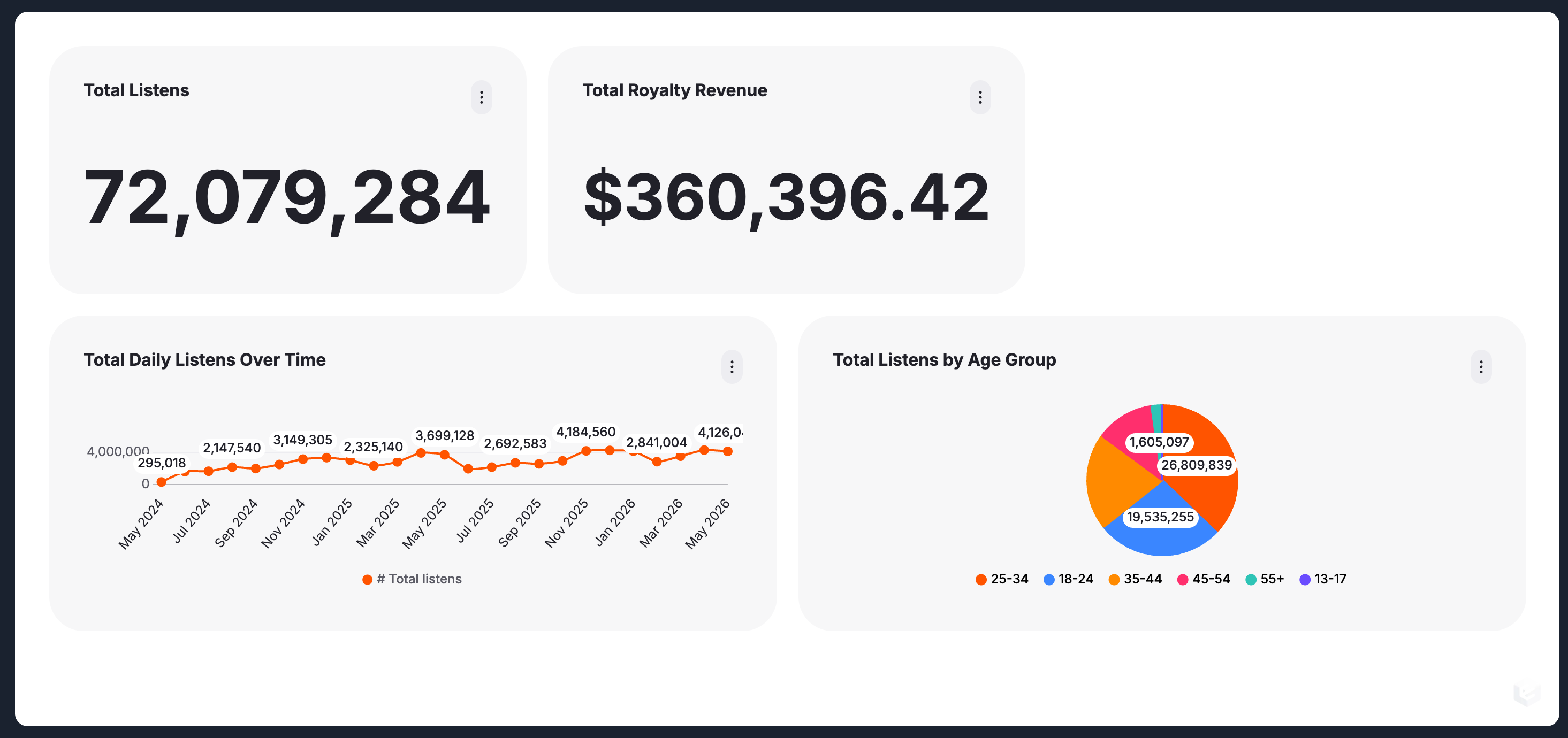
Pretty impressive! This is barely the tip of the iceberg. With Dashboards as Code, you can do everything the no-code builder can do, with or without the help of agents. You can also keep your dashboards in version control, gain better access control, quickly clone and adjust existing dashboards or components, and iterate quickly while testing.
If you’d like more information about Dashboards as Code, you can check out our documentation (opens in a new tab). We've also got a Community Slack (opens in a new tab) you can join, where we're happy to answer your questions.
See you next time!