Dashboards as Code
Dashboards as Code lets you define Embeddable dashboards directly in your codebase using <dashboard-name>.embeddable.yml files. These files can be stored in git, iterated on by your team or with AI, and previewed live in the browser via embeddable:dev.
It uses the same building blocks as the no-code builder — datasets, components, variables, and Custom Canvas — just assembled in YAML instead of by drag-and-drop. Anything you can build in the builder, you can build in code.
This is the recommended approach when you want a single source of truth for your dashboards in your code repository, rather than in the no-code builder.
To use dashboards as code, you must be on the latest Embeddable SDKs. To update, you can run npm run embeddable:upgrade and then npm i in your project, and it will install the latest versions of all Embeddable packages. If you have any issues or questions during the upgrade process, please reach out to the Embeddable team for support.
You can find a complete introductory tutorial here, including both video and text. Below is a more detailed reference for the feature.
Why use Dashboards as Code?
- Git-native workflow — dashboards live alongside your models and components, with full version history and PR reviews.
- AI-friendly — Embeddable ships a Claude skill for scaffolding and editing dashboards by prompt; any agent (Claude Code, Cursor, Codex) can work with the YAML.
- No-code builder not required — define, iterate, and deploy entirely through code.
- Live preview — changes are reflected immediately in
embeddable:devwithout a page reload. - Easily Duplicate — copy-paste YAML blocks to create new dashboards or variations on existing ones.
How it works
Define your dashboard in a <dashboard-name>.embeddable.yml file
Add a file like my-dashboard.embeddable.yml anywhere in your repo. The root key is embeddables, and each entry defines one dashboard:
embeddables:
  - name: my-embeddable # Cannot contains spaces
    title: My Embeddable # Can contain spaces, shown in the workspace
    variables:
      - name: date-range
        type: timeRange
        defaultValue: { from: '2024-01-01', to: '2024-12-31' }
    datasets:
      - name: filtered-data
        model: daily_listens
        filters:
          - member: daily_listens.date
            operator: inDateRange
            value: date-range
            valueType: VARIABLE
    widgets:
      - component: BarChart
        position:
          x: 0
          y: 0
        dimensions:
          width: 12
          height: 6
        inputs:
          - input: metric
            inputType: measure
            value: daily_listens.count
            valueType: VALUE
          - input: ds
            inputType: dataset
            value: filtered-data
            valueType: VALUE
Preview with embeddable:dev
Run embeddable:dev as normal. Your coded dashboards will appear alongside any dashboards you've built in the workspace. Changes to the <dashboard-name>.embeddable.yml file are reflected immediately via hot-reload.
Deploy by pushing your bundle
Each time you push your bundle (embeddable push), Embeddable automatically creates a new saved version of your coded dashboards. You can then publish those versions to development, staging, or production from the workspace — or reference them directly via the Versions API.
YAML reference
Top-level structure
embeddables:
  - name: string         # unique identifier, used in APIs and drilldowns, no spaces allowed
    title: string        # human-readable name shown in the workspace
    variables: [...]     # list of variables
    datasets: [...]      # list of datasets
    widgets: [...]       # widgets on the primary canvas
    customCanvas: {...}  # optional custom canvas config
Variables
Variables make dashboards interactive by storing values that datasets and components can react to.
variables:
  - name: date-range
    type: timeRange       # text | number | timeRange | dimension | measure | ...
    array: false
    defaultValue: { from: '2024-01-01', to: '2024-12-31' }
Datasets
datasets:
  - name: filtered-data         # referenced by widgets and customCanvas
    model: daily_listens        # must exist in your repo or a dependency
    filters:
      - member: daily_listens.age_group   # fully qualified dimension or measure
        operator: equals
        value: date-range
        valueType: VARIABLE     # VALUE | VARIABLE
Widgets
Each widget references a component (by name), a position, dimensions, inputs, and optionally events.
widgets:
  - component: MultiSelectFieldPro
    position:
      x: 0
      y: 3
    dimensions:
      width: 7
      height: 3
    inputs:
      - input: title
        inputType: string
        value: 'Age Group'
        valueType: VALUE
      - input: ds
        inputType: dataset
        value: filtered-data
        valueType: VALUE
        config:
          filters:
            - member: daily_listens.age_group
              operator: equals
              value: some-filter
              valueType: VALUE
          limit: 10
          order:
            - member: daily_listens.age_group
              direction: asc
      - input: dim
        inputType: dimension
        value: daily_listens.age_group
        valueType: VALUE
    events:
      - event: onChange
        action: SET_VARIABLE
        config:
          variable: date-range
          sourceType: EVENT_PROPERTY    # EVENT_PROPERTY | VARIABLE
          sourceValue: value
Input valueType options:
VALUE— a literal valueVARIABLE— references a named variable fromvariables
Event action options:
SET_VARIABLE— updates a variable when the event firesDRILLDOWN— opens another Embeddable in a modal (see drill-down)
Event sourceType options:
EVENT_PROPERTY— the data from the fired event (e.g., the clicked value)VARIABLE— the current value of a named variable
Drilldown events
events:
  - event: onClick
    action: DRILLDOWN
    config:
      embeddable: my-drilldown     # references the name of another coded embeddable
      variableOverrides:
        - variable: country
          sourceType: EVENT_PROPERTY
          sourceValue: chosenItem
Custom Canvas
If your dashboard uses a Custom Canvas, add a customCanvas block:
customCanvas:
  datasets:
    - dataset: filtered-data
    - dataset: other-dataset
  templates:
    - name: My Bar Chart
      component: BarChart
      description: Standard bar chart
      icon: stairs
      inputs:
        - input: metric
          inputType: measure
          valueType: VALUE
          value: daily_listens.count
  starterCanvas:
    widgets:
      - template: My Bar Chart
        dimensions:
          width: 7
          height: 3
        inputs:
          - input: ds
            inputType: dataset
            valueType: VALUE
            value: filtered-data
Build validation
The build will fail if your <dashboard-name>.embeddable.yml files contain any of the following:
- Unrecognized keys or invalid YAML structure
- References to components, inputs, events, variables, datasets, or templates that don't exist in your repo or dependencies
- Duplicate names within a file
- Invalid
sourceType,action, orvalueTypevalues - Config content that doesn't match the expected shape for a given input type
- An
inputTypethat doesn't match the type declared on the component's input
This strict validation means errors are caught at build time, not at runtime.
Working in the workspace
Once you push, coded dashboards appear in your team workspace just like dashboards built in the builder, with a few differences:
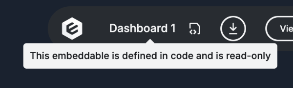
- View only in the workspace — you can open a pushed coded dashboard in preview mode, but its configuration can't be edited in the workspace builder; the code stays the source of truth. (You can edit it visually before pushing — see Editing locally.)
- Saved versions — every bundle push automatically creates a new saved version. You can switch between saved versions or publish any of them to development, staging, or production.
- No manual save — the Save Version button is not available for coded dashboards.
APIs
Coded dashboards use their name field as their identifier across all Embeddable APIs, rather than a UUID.
| API | Behaviour |
|---|---|
| Tokens API | Pass the dashboard name as embeddableId |
| Embeddables API | The dashboard name is returned as the id; title is returned as name |
| Versions API | Use the dashboard name in the URL instead of a UUID; reference saved versions as v1, v2, etc. |
| Caching API | Pass the dashboard name in the embeddableId field |
Configuration
pushEmbeddables
By default, Embeddable will push all <dashboard-name>.embeddable.yml files it finds in your repo. If your dashboards live in a separate repo from your models and components, you can control this behavior with the pushEmbeddables option in your embeddable.config.ts:
export default defineConfig({
  pushEmbeddables: true,  // default — set to false to skip pushing dashboard definitions
});
Constraints
- Coded dashboards can only reference models, components, and Embeddables that are defined in your code repo or in a dependency (e.g. Remarkable UI). They cannot reference models or dashboards defined only in the platform.
- Once pushed, coded dashboards can't be edited in the workspace builder — the code stays the source of truth. To change one, edit its
<dashboard-name>.embeddable.yml(directly, or visually in the local builder — see Editing locally) and push again.
Editing locally
While embeddable:dev is running, there are two ways to edit a coded dashboard — and both write to the same <dashboard-name>.embeddable.yml file:
- Edit the YAML directly in your code editor. Changes are reflected live in
embeddable:devvia hot-reload. - Edit it visually in the local builder. Prefer drag-and-drop to hand-writing YAML? Open the dashboard in the builder while the dev server is running, arrange it visually, and your changes sync back to the
<dashboard-name>.embeddable.ymlfile.
When you're happy, push to create a new saved version in your workspace. Local edits stay local until you push.
Visual editing only syncs back to your file while running locally. Once a dashboard is pushed, it's view-only in the workspace — the code remains the source of truth.
Converting a no-code dashboard to code
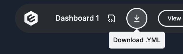
You can turn an existing no-code dashboard into a coded one. Download it from the workspace as YAML using the button at the top of the screen, then paste the result into a <dashboard-name>.embeddable.yml file and iterate from there.
Downloading will NOT overwrite the non-code version in the workspace. If you don't change the name of either, you'll end up with two dashboards sharing one name — one code-controlled and one no-code.
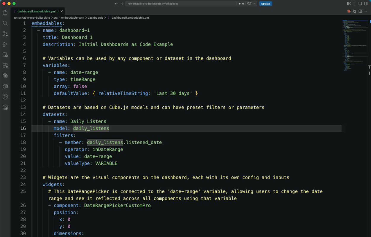
Complete Example
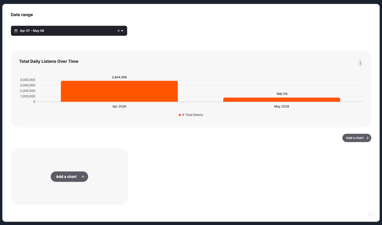
The code below produces the following dashboard, which includes a DateRangePicker that controls the date range for a BarChart showing total daily listens over time. The dashboard also includes a Custom Canvas with two preexisting components.
embeddables:
  - name: dashboard-1
    title: Dashboard 1
    description: Initial Dashboards as Code Example

    # Variables can be used by any component or dataset in the dashboard
    variables:
      - name: date-range
        type: timeRange
        array: false
        defaultValue: { relativeTimeString: 'Last 30 days' }

    # Datasets are based on Cube.js models and can have preset filters or parameters
    datasets:
      - name: Daily Listens
        model: daily_listens
        filters:
          - member: daily_listens.listened_date
            operator: inDateRange
            value: date-range
            valueType: VARIABLE

    # Widgets are the visual components on the dashboard, each with its own config and inputs
    widgets:
      # This DateRangePicker is connected to the 'date-range' variable, allowing users to change the date range and see it reflected across all components using that variable
      - component: DateRangePickerCustomPro
        position:
          x: 0
          y: 0
        dimensions:
          width: 4
          height: 7
        inputs:
          - input: title
            inputType: string
            valueType: VALUE
            value: 'Date range'
          - input: placeholder
            inputType: string
            valueType: VALUE
            value: 'Select a date-range'
          - input: selectedValue
            inputType: timeRange
            valueType: VARIABLE
            value: date-range
          - input: showTwoMonths
            inputType: boolean
            valueType: VALUE
            value: true
        events:
          - event: onChange
            action: SET_VARIABLE
            config:
              variable: date-range
              sourceType: EVENT_PROPERTY
              sourceValue: value

      # This BarChart is connected to the 'Daily Listens' dataset and will update based on the selected date range from the DateRangePicker. It shows total daily listens over time, aggregated by month.
      - component: BarChartDefaultPro
        position:
          x: 0
          y: 7
        dimensions:
          width: 12
          height: 15
        inputs:
          - input: dataset
            inputType: dataset
            valueType: VALUE
            value: Daily Listens
          - input: measures
            inputType: measure
            valueType: VALUE
            array: true
            value:
              - daily_listens.total_daily_listens
            config:
              dataset: dataset
          - input: dimension
            inputType: dimension
            valueType: VALUE
            value: daily_listens.listened_date
            config:
              dataset: dataset
              inputs:
                - input: granularity
                  value: 'month'
                  valueType: VALUE
          - input: title
            inputType: string
            valueType: VALUE
            value: 'Total Daily Listens Over Time'

    # Custom Canvas allows your users to edit and change their own dashboards within your app
    customCanvas:
      datasets:
        - dataset: Daily Listens
      templates:
        - name: donut-with-dataset
          component: DonutChartPro
          description: Donut chart with preset dataset
          icon: circular
          inputs:
            - input: dataset
              inputType: dataset
              value: Daily Listens
              valueType: VALUE
        - name: donut-blank
          component: DonutChartPro
          description: Blank donut chart
          icon: chart-pie2
          inputs: []
      starterCanvas:
        widgets: []